Conversation
| <Box | ||
| {...props} | ||
| id={id} | ||
| role="banner" |
There was a problem hiding this comment.
A note: if I set this role="banner" and I try to render more than one banner at the time (i.e. one stacked top of each other) I see that my a11y test doesn't pass:
  ● Banner › renders with no a11y violations

    expect(received).toHaveNoViolations(expected)

    Expected the HTML found at $('.banner-info') to have no violations:

    <div role="banner" aria-live="polite" class="banner banner-info box borderRadius-standard">

    Received:

    "Document should not have more than one banner landmark (landmark-no-duplicate-banner)"

    Fix any of the following:
      Document has more than one banner landmark

    You can find more information on this issue here:
    https://dequeuniversity.com/rules/axe/4.2/landmark-no-duplicate-banner?application=axeAPI

    ────────

    Expected the HTML found at $('.banner-info') to have no violations:

    <div role="banner" aria-live="polite" class="banner banner-info box borderRadius-standard">

    Received:

    "Ensures landmarks are unique (landmark-unique)"

    Fix any of the following:
      The landmark must have a unique aria-label, aria-labelledby, or title to make landmarks distinguishable

    You can find more information on this issue here:
    https://dequeuniversity.com/rules/axe/4.2/landmark-unique?application=axeAPI

      79 |         )
      80 |         const results = await axe(container)
    > 81 |         expect(results).toHaveNoViolations()
         |                         ^
      82 |     })
      83 | })
      84 |

      at Object.toHaveNoViolations (src/new-components/banner/banner.test.tsx:81:25)
More info at:
- https://dequeuniversity.com/rules/axe/4.2/landmark-no-duplicate-banner?application=axeAPI
- https://dequeuniversity.com/rules/axe/4.2/landmark-unique?application=axeAPI
The role="banner" ARIA landmark should only appear once on an element that is unique to the HTML document
I don't think this is a reason to remove the (appropriate) role="banner" though... Unless we think this won't be used as a true "banner" but more like a generic advisory and can have multiple per page. 🤔 Cc. @gnapse
There was a problem hiding this comment.
Wow, it's good that we have these jest axe tests in place.
Indeed, it seems this component should not use role="banner". In spite of our choice of name, in terms of aria roles, "banner" seems to something else entirely. According to this:
The
bannerrole is for defining a global site header, which usually includes a logo, company name, search feature, and possibly the global navigation or a slogan. It is generally located at the top of the page.
So it's nothing like what you are developing here.
Looking at the list of existing aria roles, I think this component is in line with role="note". Check that out, and if you agree, make the change.
There was a problem hiding this comment.
@gnapse Thank you for all the context! 🙏 I think role="note" is perfect, as this new component looks like something slightly more prominent, that we want the users to pay attention to, but nothing more (no actual extra meaning).
Does this in any way suggest that we should rename our new reactist component to something else? I felt like Banner worked well, but I also feel like I don't know English enough maybe.
There was a problem hiding this comment.
Let's ask @craigcarlyle, not only as a native English speaker, but as our accessibility DRD.
Craig, the question is: in light of the issue around what role="banner" really means, do you think we should not name this component Banner? Maybe we should name it Note instead? Regardless of the outward name, we'll use role="note" internally.
There was a problem hiding this comment.
First of all, I'm happy to see that the automated tests caught this 🎉
I think setting the role to note is okay, but thinking about our use cases maybe we should follow the example of the Banner component in the Polaris design system and:
- Set the
roletostatus - Set the
aria-liveproperty topolite - Add
tabindex="0"(so that it can be navigated to with a keyboard)
This means that users with screen reading software would:
- Get notified eventually that they're viewing an achieved project
- Get notified eventually that they're previewing a project
- Get notified eventually that they've hit a project limit
If we went with the note option the user would have to manually navigate to the content to discover it instead of the content being announced automatically. I think it may be the better option.
And to answer the last question, I think the "Banner" name is fine. The name is for developers rather than the end consumer 🙂
There was a problem hiding this comment.
@craigcarlyle, name-similarities aside, it does not look like Polaris' component is meant for the same use cases as ours.
- That one looks more like something that appears triggered by some user action (judging by that default example of "Order archived") and it is dismissable.
- Ours is meant to appear from the start if the conditions for it are met, and it is not dismissable, but stays around. At least not dismissable by clicking a close button. The only way you can dismiss a "This project is preview only" is to click on "Join project", a permanent action that removes the condition that made the banner appear.
I'm not saying these are reasons good enough to not use role="status", but I do see the difference with what, at a glance, the Polaris' component seems to be about. With all this in mind, do you still think we should use that option? The part about this message being announced might be interesting. But, again, this message does not suddenly appear due to a user action.
There was a problem hiding this comment.
Actually, that Polaris component seems more like Reactist's Alert, a component that is visually similar to this one, but with different semantics. Check out this comment where I proposed to make these different things in the design system.
There was a problem hiding this comment.
@gnapse I still believe it's the better option and I think it's differentiated between the Alert component enough with the role difference (status vs alert). However, I don't feel too strongly about it.
Looking at Polaris closer, our use case may be closer to the Callout card component which has no special role or aria-* properties at all. Maybe we're overthinking it? 🤷♂️
There was a problem hiding this comment.
Yes, viewed under that light, I see your point. Comparing role="status" vs. role="alert", I see this about status:
The
statusrole defines a live region containing advisory information for the user that is not important enough to be an alert.
And we do keep the name Banner, right?
Anyway, thanks!
What do you think @engfragui? Do we have a winner? 😄
There was a problem hiding this comment.
Thank you both for this discussion! 🙏 Let's go with role "status", which feels like in between "alert" and "note" and might fit well with our intent of "we want the user to pay attention to this, but not really alert them".
Just to confirm, this is what I have:
            role="status"
            aria-labelledby={titleId}
            aria-describedby={descriptionId}
            aria-live="polite"
            tabIndex={0}
There was a problem hiding this comment.
This is looking good. Great work!
Main reason for requesting changes is the comment about the types for the title and description props, which I think are a hard requirement (e.g. when we pass translations that need the <Interpolate /> component in Todoist).
The rest of the comments vary in optionality.
| /** | ||
| * The title to be displayed at the top of the Banner. | ||
| */ | ||
| title: string | ||
| /** | ||
| * An optional description to be displayed inside the Banner. | ||
| */ | ||
| description?: string |
There was a problem hiding this comment.
I tend to prefer to declare these as type React.ReactNode instead.
| /** | |
| * The title to be displayed at the top of the Banner. | |
| */ | |
| title: string | |
| /** | |
| * An optional description to be displayed inside the Banner. | |
| */ | |
| description?: string | |
| /** | |
| * The title to be displayed at the top of the Banner. | |
| */ | |
| title: React.ReactNode | |
| /** | |
| * An optional description to be displayed inside the Banner. | |
| */ | |
| description?: React.ReactNode |
It enables passing rich text, for instance, containing links or bold or emphasized text:
<Banner
  title={<>This is really <strong>important</strong></>}
  description={<>If you're curious, <a href="#">learn more</a>.</>}
/>There was a problem hiding this comment.
@gnapse This makes a lot of sense! 😅 I added a unit test and also an example in the stories. Which lead me to:
Is this (more appropriate href colors) something that I should already ask Design team about or should we just move forward since we don't have any use cases (in todoist-web) at the moment?
There was a problem hiding this comment.
What if you use <TextLink /> instead of <a />? Though it probably won't get the right color either, because we do not have colors for dark mode here in Reactist. Unless you also provide the necessary CSS variable override as you do with the rest of the colors for dark mode in this story.
 engfragui
force-pushed
the
francesca/banner-component
branch
from
engfragui
force-pushed
the
francesca/banner-component
branch
from
fc5147b to
b1e0b4b
Compare
 gnapse
left a comment
gnapse
left a comment
gnapse
left a comment
There was a problem hiding this comment.
I can approve already, even though we may still wait for Craig's input on the component name, and any other minor issue.
|
Looking at https://github.com/Doist/todoist-web/pull/5846 (whose design is from this design mock) it seems like we might need/want to add some sort of "subtle" tone as well to our Banner (no background, gray button). Happy to do this as a follow-up PR, possibly after getting feedback/confirmation from the Design team (https://www.figma.com/file/ypFhMfTimwHRViD9zAZhAD?node-id=67:197199#355231551). |
|
Status update on this PR: I'm mostly just trying to get the final requirements from Design team (see this comment https://www.figma.com/file/LYlWNzvhMDh907l07mPPQk?node-id=8321:272616#353688502) |
| aria-hidden | ||
| style={{ | ||
| /* Make sure the icon is centered vertically */ | ||
| lineHeight: 0, |
There was a problem hiding this comment.
This comes from the existing banner-like component we implemented in todoist-web https://github.com/Doist/todoist-web/blob/main/src/react_components/project-view/project-view-header.tsx#L349-L353.
I didn't have this at first and the icons were placed slightly off center, which was somewhat noticeable for banners without description (only title).
3 participants
Fixes https://github.com/Doist/Issues/issues/9215
Short description
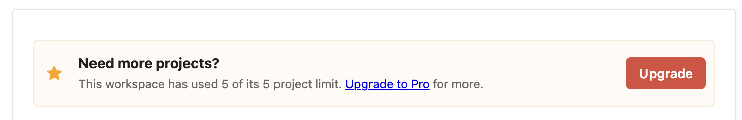
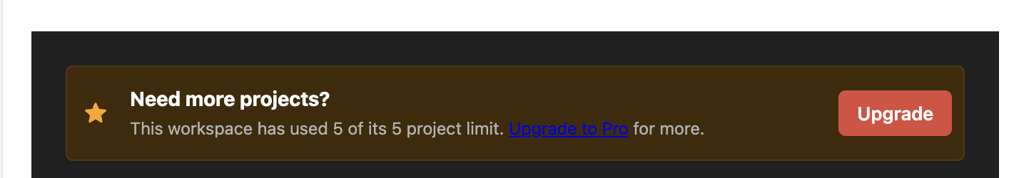
New Banner component! 🎉
CleanShot.2023-01-26.at.13.20.26.mp4
Note: in this piece of code you can see the current implementation of this type of banners that we're already using in production.
Our new Reactist banner component needs to be equivalent (or very close) so that we can use in todoist-web instead of the current custom implementation.
Reference
PR Checklist
npm run validateand made sure no errors / warnings were shownCHANGELOG.mdpackage.jsonandpackage-lock.json(npm --no-git-tag-version version <major|minor|patch>) refnpm run build-all)Versioning
New feature (MINOR bump: v19.0.1 -> v19.1.0)